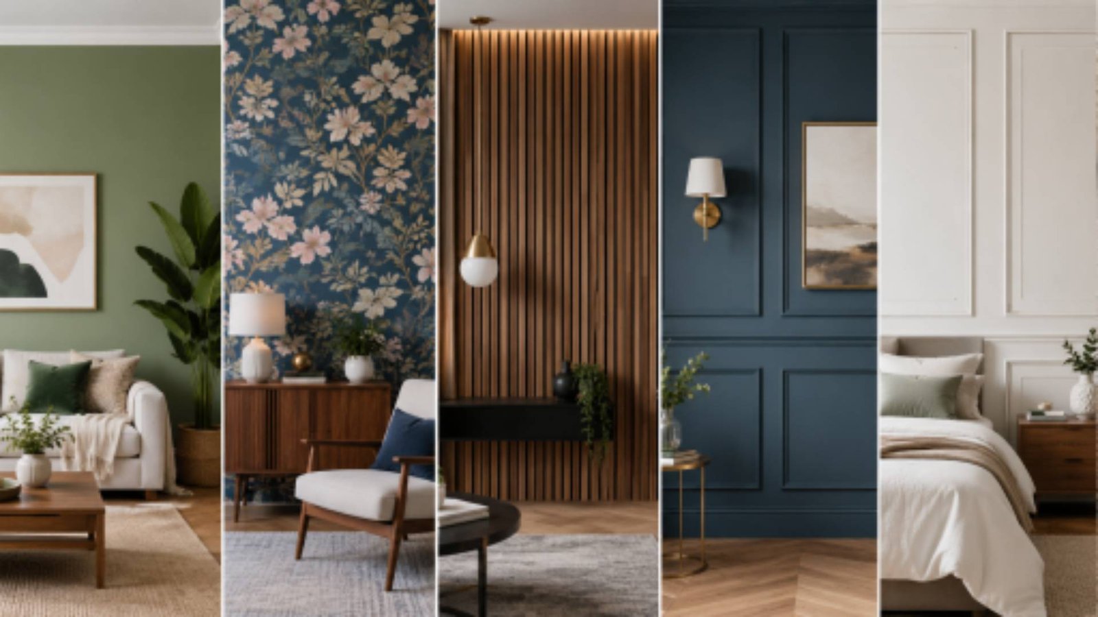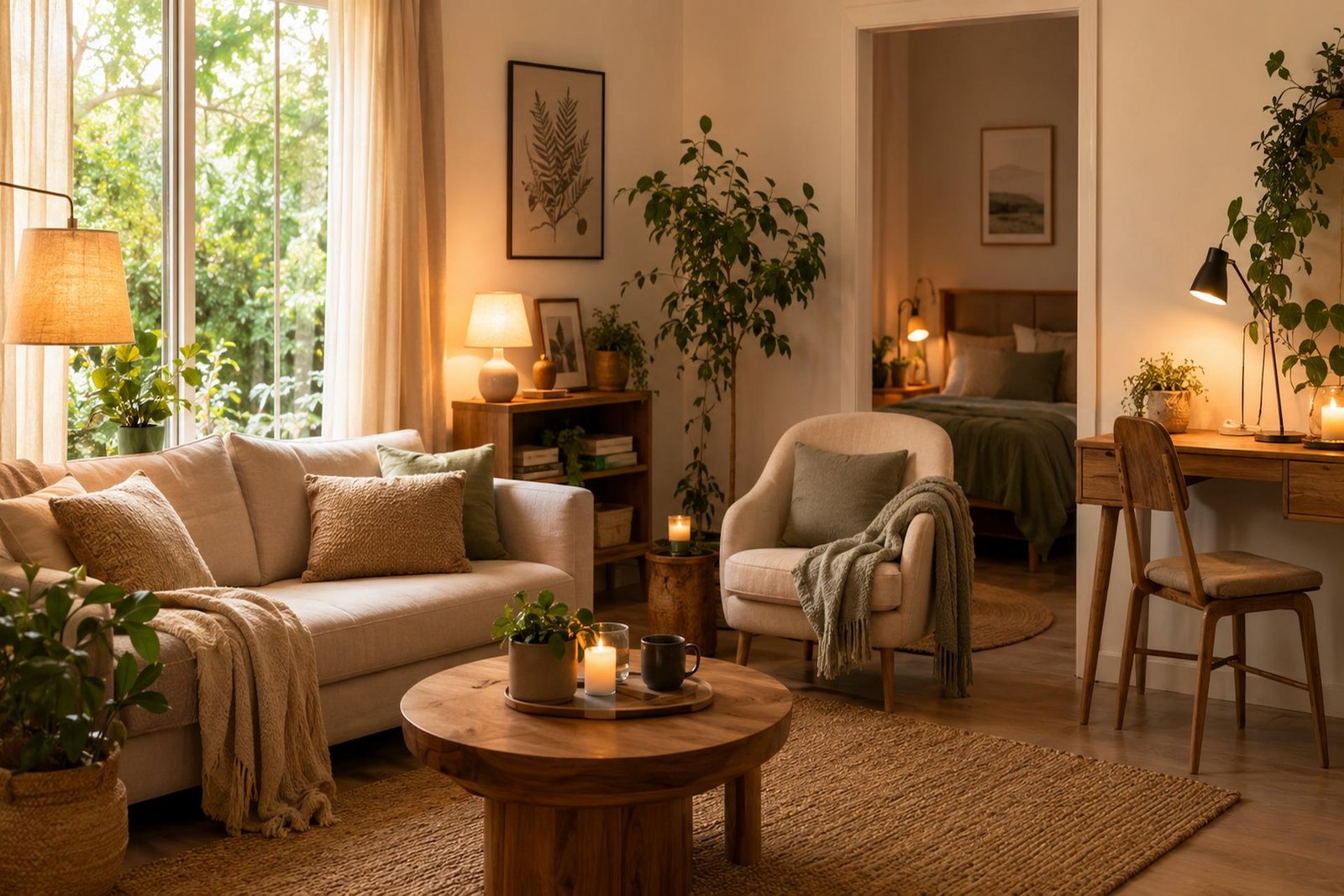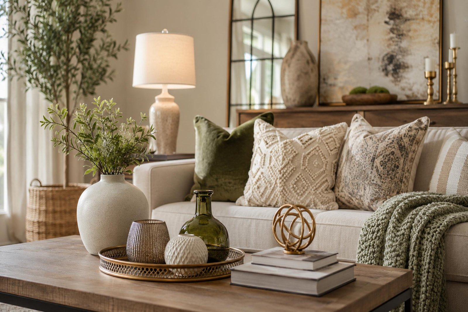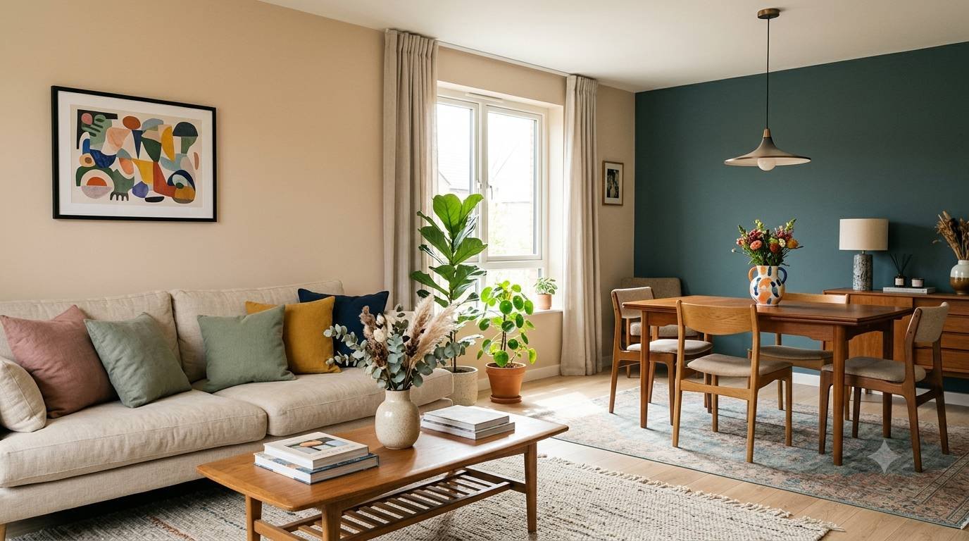
Introduction
A well-planned colour palette does far more than make a home look attractive. It shapes the mood of every room, creates visual harmony, and helps your entire home feel connected. Whether you’re decorating a new house, renovating a single room, or simply refreshing your interiors with paint and furnishings, choosing the right colours is one of the most important design decisions you’ll make.
The good news is that creating a cohesive interior doesn’t require professional design training. With a clear understanding of colour relationships, lighting, room function, and balance, anyone can build a home that feels stylish, welcoming, and uniquely personal.
This guide walks you through everything you need to know about choosing the perfect colour palette, from understanding colour psychology to selecting shades for every room while keeping your entire home visually connected.
Why a Cohesive Colour Palette Matters
One of the biggest differences between professionally designed homes and randomly decorated spaces is consistency. A cohesive colour palette creates a smooth visual flow from one room to another without making every space look identical.
Instead of feeling disconnected, your home develops a sense of harmony. Each room can have its own personality while still belonging to the same overall design story.
A cohesive palette also makes decorating easier. Furniture, artwork, textiles, flooring, and accessories naturally work together, reducing costly decorating mistakes and making future updates much simpler.
Understanding the Basics of Colour Theory
Before choosing paint colours, it’s helpful to understand how colours work together.
Primary Colours
Red, blue, and yellow are the foundation of every colour palette.
Secondary Colours
Green, orange, and purple are created by mixing primary colours.
Tertiary Colours
These are combinations of primary and secondary colours, offering a wider range of sophisticated shades.
Understanding these relationships helps you confidently mix colours while maintaining balance throughout your home.
Learn the Difference Between Warm and Cool Colours
Every colour has a temperature that influences how a room feels.
Warm Colours
Warm tones include:
- Beige
- Cream
- Terracotta
- Warm white
- Mustard
- Soft peach
- Rich browns
These colours create cozy, inviting, and comfortable spaces.
Cool Colours
Cool tones include:
- Blue
- Green
- Grey
- Lavender
- Soft teal
- Crisp white
These colours promote relaxation, calmness, and openness.
Most successful interiors combine both warm and cool elements to create visual balance.
Start With One Dominant Colour
Rather than choosing colours for every room independently, begin with one main colour that represents the overall mood you want throughout the home.
Your dominant colour becomes the foundation for:
- Walls
- Large furniture
- Flooring
- Rugs
- Cabinetry
Once this base is established, complementary colours can be introduced through accessories and smaller decorative elements.
Use the 60-30-10 Rule
Interior designers often rely on the 60-30-10 rule because it creates balanced colour distribution.
- 60% should be the dominant colour, usually walls and larger surfaces.
- 30% should be a secondary colour used for furniture, curtains, or cabinetry.
- 10% should be an accent colour that adds personality through cushions, artwork, lamps, and decorative accessories.
This simple approach prevents rooms from feeling overwhelming while adding visual interest.
Consider Natural Light Before Choosing Paint
Lighting changes how colours appear throughout the day.
Rooms with abundant sunlight often make colours appear brighter and warmer.
North-facing rooms usually receive cooler light, making paint colours look slightly darker and more muted.
South-facing rooms typically enhance warmth and brightness, allowing both warm and cool colours to perform beautifully.
Before committing to a colour, test paint samples on multiple walls and observe them during morning, afternoon, and evening light.
Build a Whole-Home Colour Palette
One of the easiest ways to create cohesive interiors is to develop a whole-home colour palette.
Instead of selecting completely different colours for each room, choose a family of complementary shades.
For example:
- Soft warm white throughout the house
- Light greige in bedrooms
- Sage green in the office
- Navy accents in the living room
- Charcoal details in the kitchen
Each room feels distinct while maintaining continuity.
Choosing Colours for the Living Room
The living room is often the heart of the home, making it an excellent place to establish your main palette.
Popular living room colours include:
- Warm white
- Greige
- Taupe
- Soft sage
- Light olive
- Muted blue
- Sand
- Warm grey
Layer these colours with natural wood, textured fabrics, and carefully chosen accent pieces to create depth.
Choosing Colours for the Kitchen
The kitchen benefits from colours that feel fresh, clean, and timeless.
Popular kitchen palettes include:
- White and oak
- Cream and sage green
- Soft grey and navy
- Beige and charcoal
- Warm greige and black accents
Cabinet colours should coordinate with flooring, countertops, and backsplash materials for a unified look.
Choosing Colours for the Dining Room
Dining rooms offer an opportunity to introduce slightly richer tones while maintaining harmony with nearby spaces.
Excellent options include:
- Olive green
- Deep navy
- Warm terracotta
- Mushroom grey
- Rich taupe
- Dusty blue
These colours create an inviting atmosphere that encourages conversation and relaxation.
Choosing Colours for Bedrooms
Bedrooms should promote rest and comfort.
Calming colour choices include:
- Soft blue
- Muted green
- Warm beige
- Lavender grey
- Dusty rose
- Cream
- Soft white
Avoid using extremely bright colours across large wall areas, as they may feel overstimulating over time.
Choosing Colours for Bathrooms
Bathrooms often appear larger when lighter colours are used.
Popular bathroom palettes include:
- White and marble
- Soft grey
- Pale blue
- Seafoam green
- Warm ivory
- Light sage
Natural wood accessories and greenery soften the space and prevent it from feeling clinical.
Choosing Colours for Home Offices
A productive workspace should feel focused without becoming dull.
Great office colours include:
- Muted green
- Navy
- Soft charcoal
- Warm white
- Light taupe
- Dusty blue
These colours reduce visual distraction while maintaining a professional appearance.
Creating Flow Between Rooms
Open floor plans require extra attention to colour transitions.
Rather than changing colours dramatically between connected spaces, use gradual shifts within the same colour family.
For example:
Living room:
- Warm white
Dining room:
- Light greige
Kitchen:
- Soft sage
Because these colours share similar undertones, they transition naturally from one room to another.
Don’t Forget Undertones
Two shades of beige can look completely different because of their undertones.
Common undertones include:
- Yellow
- Pink
- Blue
- Green
- Violet
When mixing paint colours, flooring, countertops, and furniture, matching undertones creates a polished, professional result.
Ignoring undertones is one of the most common reasons beautifully selected colours appear mismatched once installed.
Use Accent Colours Thoughtfully
Accent colours bring personality into your home without overwhelming the design.
Good places to introduce accents include:
- Artwork
- Throw pillows
- Blankets
- Vases
- Lamps
- Decorative books
- Curtains
- Rugs
Because accents are easier to replace than paint or furniture, they allow seasonal updates without major renovations.
Add Texture Alongside Colour
Even a neutral colour palette can feel rich and layered when different textures are combined.
Mix materials such as:
- Linen
- Leather
- Wood
- Stone
- Glass
- Metal
- Wool
- Woven baskets
Texture creates visual interest while allowing a restrained colour palette to feel warm and inviting.
Balance Bold Colours With Neutrals
Bold colours work best when paired with calming neutrals.
A navy feature wall, emerald sofa, or burnt orange armchair becomes more sophisticated when surrounded by softer shades like white, beige, cream, or warm grey.
This balance keeps rooms feeling energetic without becoming visually overwhelming.
Common Colour Mistakes to Avoid
Many decorating frustrations come from avoidable colour mistakes.
Common issues include:
- Choosing paint before furniture.
- Ignoring natural lighting.
- Using too many competing colours.
- Forgetting undertones.
- Following short-lived trends instead of personal preferences.
- Using bright colours in every room.
- Skipping paint sample testing.
- Decorating each room without considering the rest of the house.
Taking time to plan your palette prevents expensive corrections later.
Should Every Room Be the Same Colour?
Not at all.
Each room should reflect its purpose and personality while still feeling connected to the rest of the home.
Think of your home as a collection of chapters within the same book rather than completely separate stories. Subtle variations in tone, depth, and accent colours keep interiors interesting while maintaining consistency.
How to Test Colours Before Committing
Never rely solely on a tiny paint swatch.
Instead:
- Purchase sample pots.
- Paint large test areas on multiple walls.
- Observe colours during different times of day.
- Compare them with flooring, furniture, curtains, and lighting.
- Live with the samples for several days before making a final decision.
This simple process dramatically reduces the risk of disappointment.
Timeless Colour Palette Ideas
If you prefer interiors that remain stylish for years, consider combinations such as:
- Warm white and oak
- Greige with black accents
- Cream and olive green
- Soft blue and natural wood
- Taupe with charcoal
- Sage green and brass
- Beige with terracotta
- Navy and crisp white
These palettes remain elegant across changing design trends.
Frequently Asked Questions
How many colours should a whole-home palette include?
Most cohesive homes use three to five main colours with a few accent shades. This creates variety without making the home feel disconnected.
Can I mix warm and cool colours?
Yes. Mixing warm and cool colours often creates the most balanced interiors. The key is ensuring they share complementary undertones.
Should walls and trim be the same colour?
They can be. Using the same colour in different finishes creates a modern, seamless appearance, while contrasting trim provides more definition.
What is the safest wall colour for most homes?
Soft warm white, greige, light beige, and gentle grey are versatile choices that pair well with many furniture styles and decorating schemes.
How often should I update my home’s colour palette?
Large elements like walls and flooring should be chosen with longevity in mind. Smaller accent colours can be refreshed every few years to keep your interiors feeling current.
Conclusion
Choosing the perfect colour palette is about more than picking attractive paint shades. It’s about creating a home that feels balanced, welcoming, and connected from room to room. By understanding colour theory, considering natural light, paying attention to undertones, and using a consistent palette throughout your home, you can achieve interiors that feel thoughtful and timeless.
Remember that the most successful homes reflect the people who live in them. While trends can offer inspiration, your colour choices should support your lifestyle, complement your furnishings, and create spaces where you genuinely enjoy spending time. With careful planning and a cohesive approach, you can build an interior that remains beautiful, functional, and inviting for years to come.